.Net MAUIで枠線を引くには、BorderかFrameを利用すると思います。
しかし、BorderやFrameは線の太さを上下左右の個々に設定できません。当記事では、線の太さを個々に設定できる枠線を用意していきます。
紹介環境
当記事は以下の環境で作成しています。
開発環境
- Visual Studio 2022
- .Net 8
枠線を引けるコントローラについて
枠線を引けるコントローラを紹介していきます。
Borderについて
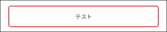
Borderは以下のように実装します。
<Border Stroke="Red" StrokeThickness="2">
    <Border.StrokeShape>
        <RoundRectangle CornerRadius="5" />
    </Border.StrokeShape>
    <Label
        HorizontalTextAlignment="Center"
        VerticalTextAlignment="Center"
        HeightRequest="50"
        Text="テスト"
        BackgroundColor="#fff" />
</Border>
見た目は以下のようになります。
Microsoftは、以下のリンクで紹介されています。
Frameについて
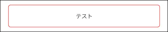
Frameは以下のように実装します。
<Frame BorderColor="Red" Padding="2" CornerRadius="5">
    <Label
        HorizontalTextAlignment="Center"
        VerticalTextAlignment="Center"
        HeightRequest="50"
        Text="テスト"
        BackgroundColor="#fff" />
</Frame>
見た目は以下のようになります。
Microsoftは、以下のリンクで紹介されています。
線の太さを個々に設定できる枠線について
線の太さを個々に設定できるコントローラを作成していきます。
手順1:線の太さを個々に設定できるXAMLを用意します
カスタムコントロールに作成するためにContentViewを利用します。作成した内容が以下のようになります。
<?xml version="1.0" encoding="utf-8" ?>
<ContentView xmlns="http://schemas.microsoft.com/dotnet/2021/maui"
             xmlns:x="http://schemas.microsoft.com/winfx/2009/xaml"
             x:Class="SampleApp.CustomControl.CustomBorder"
             x:Name="this">
    <ContentView.ControlTemplate>
        <ControlTemplate>
            <Border Stroke="Transparent"
                    StrokeThickness="0"
                    Background="{Binding Source={x:Reference this}, Path=Stroke}"
                    Padding="{Binding Source={x:Reference this}, Path=StrokeThickness}">
                <Border.StrokeShape>
                    <RoundRectangle CornerRadius="{Binding Source={x:Reference this}, Path=CornerRadius}" />
                </Border.StrokeShape>
                <Border Stroke="Transparent" StrokeThickness="0">
                    <Border.StrokeShape>
                        <RoundRectangle CornerRadius="{Binding Source={x:Reference this}, Path=InsideCornerRadius}" />
                    </Border.StrokeShape>
                    <ContentPresenter />
                </Border>
            </Border>
        </ControlTemplate>
    </ContentView.ControlTemplate>
</ContentView>線の太さを個々に設定できる枠線は、外観のカスタマイズで用意するためContentView.ControlTemplateを利用しています。また、枠線の内容はContentPresenterを利用しています。
線の太さを個々に設定できるように、線の太さをBorder.Paddingで線の色をBorder.Backgroundで表現しています。
手順2:設定できるプロパティを準備します
線の太さなどのプロパティを以下のように用意しています。
用意しているプロパティは、CornerRadius(角の半径)、InsideCornerRadius(内側の角の半径)、Stroke(線の色)、StrokeThickness(線の太さ)になります。
namespace SampleApp.CustomControl;

public partial class CustomBorder : ContentView
{
    public static readonly BindableProperty CornerRadiusProperty = BindableProperty.Create(nameof(CornerRadius), typeof(CornerRadius), typeof(CustomBorder), new CornerRadius(), propertyChanged: (bindable, oldValue, newValue) =>
            {
                (bindable as CustomBorder)?.SetInsideCornerRadius();
            });

    public static readonly BindableProperty InsideCornerRadiusProperty = BindableProperty.Create(nameof(InsideCornerRadius), typeof(CornerRadius), typeof(CustomBorder), new CornerRadius());

    public static readonly BindableProperty StrokeProperty =
                BindableProperty.Create(nameof(Stroke), typeof(Brush), typeof(CustomBorder), null);

    public static readonly BindableProperty StrokeThicknessProperty =
        BindableProperty.Create(nameof(StrokeThickness), typeof(Thickness), typeof(CustomBorder), default(Thickness),
            propertyChanged: (bindable, oldValue, newValue) =>
            {
                (bindable as CustomBorder)?.SetInsideCornerRadius();
            });

    public CustomBorder()
    {
        InitializeComponent();
    }

    /// <summary>
    /// 角の半径を設定します。
    /// </summary>
    public CornerRadius CornerRadius
    {
        get => (CornerRadius)GetValue(CornerRadiusProperty);
        set => SetValue(CornerRadiusProperty, value);
    }

    /// <summary>
    /// 内側の角の半径を設定します。
    /// </summary>
    public CornerRadius InsideCornerRadius
    {
        get => (CornerRadius)GetValue(InsideCornerRadiusProperty);
        private set => SetValue(InsideCornerRadiusProperty, value);
    }

    /// <summary>
    /// 線の色を設定します。
    /// </summary>
    public Brush? Stroke
    {
        get => (Brush?)GetValue(StrokeProperty);
        set => SetValue(StrokeProperty, value);
    }

    /// <summary>
    /// 線の太さを設定します。
    /// </summary>
    public Thickness StrokeThickness
    {
        get => (Thickness)GetValue(StrokeThicknessProperty);
        set => SetValue(StrokeThicknessProperty, value);
    }

    /// <summary>
    /// InsideCornerRadiusを設定します。
    /// </summary>
    private void SetInsideCornerRadius()
    {
        double[] thicknessList =
            [
            StrokeThickness.Left,
            StrokeThickness.Right,
            StrokeThickness.Top,
            StrokeThickness.Bottom,
            ];
        double thickness = thicknessList.Min();
        InsideCornerRadius = new CornerRadius(
            CornerRadius.TopLeft - thickness,
            CornerRadius.TopRight - thickness,
            CornerRadius.BottomLeft - thickness,
            CornerRadius.BottomRight - thickness);
    }
}InsideCornerRadiusは、CornerRadiusとStrokeThicknessから自動で算出するようにしています。
実際に利用します
線の太さを個々に設定できるコントローラを利用するために、用意したカスタムコントロールの名前空間をXAMLに指定する必要があります。
当記事ではSampleApp.CustomControlに配置しているため、以下のようになります。
xmlns:control="clr-namespace:SampleApp.CustomControl"実際に利用した例が以下のようになります。枠線の内容はCustomBorderで囲むように記載します。
<?xml version="1.0" encoding="utf-8" ?>
<ContentPage
    xmlns="http://schemas.microsoft.com/dotnet/2021/maui"
    xmlns:x="http://schemas.microsoft.com/winfx/2009/xaml"
    xmlns:control="clr-namespace:SampleApp.CustomControl"
    x:Class="SampleApp.MainPage">
    <VerticalStackLayout Padding="20">
        <control:CustomBorder
                Stroke="Green"
                CornerRadius="10,50,20,0"
                StrokeThickness="20,15,5,10">
            <Label
                HorizontalTextAlignment="Center"
                VerticalTextAlignment="Center"
                HeightRequest="50"
                Text="テスト"
                BackgroundColor="#fff" />
        </control:CustomBorder>
    </VerticalStackLayout>
</ContentPage>
見た目は以下のようになります。

終わりに
.Net MAUIの枠線にはBorderをよく利用すると思います。しかし、線の太さが個々に指定できず困ったので当記事を作成してみました。当記事が役に立てば幸いです。