当記事では、.Net MAUIでラジオボタンのアイコンを変更する方法について紹介していきます。
紹介環境
当記事は以下の環境で作成しています。
開発環境
- Visual Studio 2022
- .Net 8
ラジオボタンについて
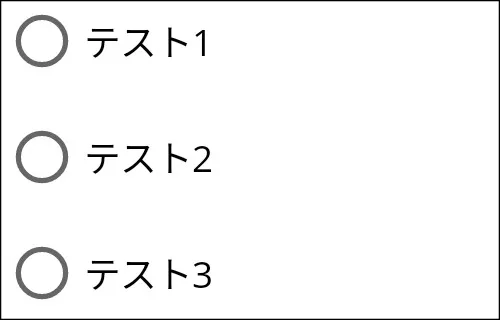
ラジオボタンの実装方法は以下のようになります。Contentの部分がテキストになります。
<VerticalStackLayout>
    <RadioButton Content="テスト1" />
    <RadioButton Content="テスト2" />
    <RadioButton Content="テスト3" />
</VerticalStackLayout>
動作させたイメージが以下のようになります。
Microsoftは、以下のリンクで紹介されています。
アイコンの変更方法について
ラジオボタンのアイコンの変更は、以下の手順で実装していきます。
手順1:ラジオボタンの見た目を変更します
ラジオボタンの見た目を変更するには、ControlTemplateを利用しています。ただし、ControlTemplateだけ利用するとRadioButton.Contentが変更されます。RadioButton.Contentを呼び出すためにContentPresenterを利用します。
<Style TargetType="RadioButton">
    <Setter Property="ControlTemplate">
        <ControlTemplate>
            <Grid ColumnDefinitions="Auto,*" ColumnSpacing="5">
                <!-- RadioButton.Contentの内容が表示されます。 -->
                <ContentPresenter Grid.Column="1" />
            </Grid>
        </ControlTemplate>
    </Setter>
</Style>
手順2:ラジオボタンのアイコンを作成します
ラジオボタンのアイコンは、選択時・未選択時に合わせて見た目を変更する必要があります。そこで、VisualStateManagerクラスを利用します。VisualStateManagerクラスは、ラジオボタンの選択時(Checked)・未選択時(Unchecked)に合わせてスタイルを変更することができます。
<Style TargetType="RadioButton">
    <Setter Property="ControlTemplate">
        <ControlTemplate>
            <Grid ColumnDefinitions="Auto,*" ColumnSpacing="5">
                <VisualStateManager.VisualStateGroups>
                    <VisualStateGroupList>
                        <VisualStateGroup x:Name="CheckedStates">

                            <!-- 選択時 -->
                            <VisualState x:Name="Checked">
                                <VisualState.Setters>
                                    <Setter TargetName="mark" Property="Background" Value="Green" />
                                </VisualState.Setters>
                            </VisualState>

                            <!-- 未選択時 -->
                            <VisualState x:Name="Unchecked">
                                <VisualState.Setters>
                                    <Setter TargetName="mark" Property="Background" Value="Pink" />
                                </VisualState.Setters>
                            </VisualState>
                        </VisualStateGroup>
                    </VisualStateGroupList>
                </VisualStateManager.VisualStateGroups>

                <!-- ここでアイコンの見た目を決めます。 -->
                <Border
                    Stroke="Black"
                    Padding="3"
                    HeightRequest="16"
                    WidthRequest="16"
                    BackgroundColor="White">
                    <BoxView x:Name="mark" />
                </Border>

                <!-- RadioButton.Contentの内容が表示されます。 -->
                <ContentPresenter Grid.Column="1" />
            </Grid>
        </ControlTemplate>
    </Setter>
</Style>
実際に利用します
ここまでの内容を利用することでラジオボタンのアイコンを変更することができます。
実装例は以下のようになります。
<VerticalStackLayout>
<VerticalStackLayout.Resources>
<Style TargetType="RadioButton">
<Setter Property="ControlTemplate">
<ControlTemplate>
<Grid ColumnDefinitions="Auto,*" ColumnSpacing="5">
<VisualStateManager.VisualStateGroups>
<VisualStateGroupList>
<VisualStateGroup x:Name="CheckedStates">
<!-- 選択時 -->
<VisualState x:Name="Checked">
<VisualState.Setters>
<Setter
TargetName="mark"
Property="Background" Value="Green" />
</VisualState.Setters>
</VisualState>
<!-- 未選択時 -->
<VisualState x:Name="Unchecked">
<VisualState.Setters>
<Setter
TargetName="mark"
Property="Background" Value="Pink" />
</VisualState.Setters>
</VisualState>
</VisualStateGroup>
</VisualStateGroupList>
</VisualStateManager.VisualStateGroups>
<!-- ここでアイコンの見た目を決めます。 -->
<Border
Stroke="Black"
Padding="3"
HeightRequest="16"
WidthRequest="16"
BackgroundColor="White">
<BoxView x:Name="mark" />
</Border>
<!-- Contentの内容が表示されます。 -->
<ContentPresenter Grid.Column="1" />
</Grid>
</ControlTemplate>
</Setter>
</Style>
</VerticalStackLayout.Resources>
<RadioButton Content="テスト1" />
<RadioButton Content="テスト2" />
<RadioButton Content="テスト3" />
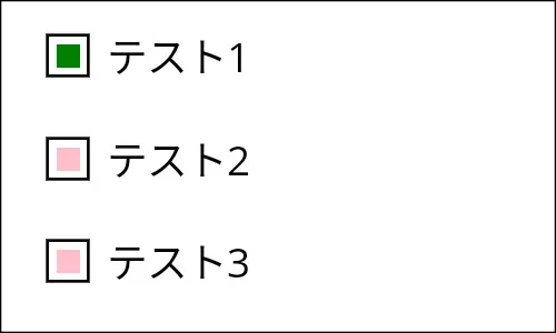
</VerticalStackLayout>動作させたイメージは以下のようになります。アイコンの色は、選択時に緑色になり、未選択時にピンク色になります。
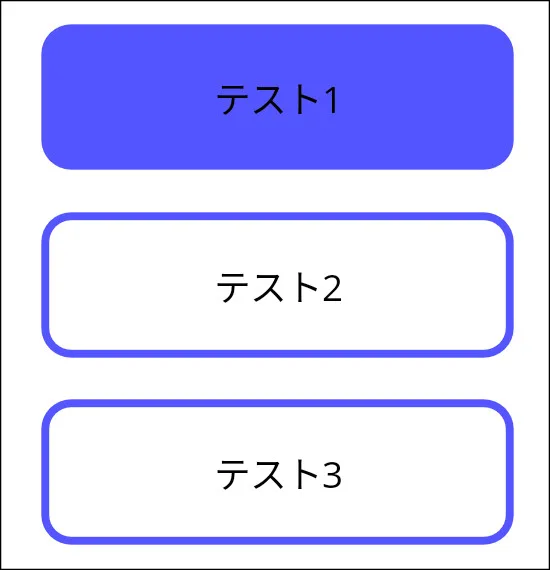
アイコン以外にも利用できる?
アイコンの変更以外にも利用することができます。ここではボタンの見た目で背景色を変更していきます。
ソースは以下のようになります。
<VerticalStackLayout WidthRequest="180" HorizontalOptions="Start">
    <VerticalStackLayout.Resources>
        <Style TargetType="RadioButton">
            <Setter Property="ControlTemplate">
                <ControlTemplate>
                    <Border Stroke="#55f" StrokeThickness="3">
                        <Border.StrokeShape>
                            <RoundRectangle CornerRadius="10" />
                        </Border.StrokeShape>
                        <VisualStateManager.VisualStateGroups>
                            <VisualStateGroupList>
                                <VisualStateGroup x:Name="CheckedStates">

                                    <!-- 選択時 -->
                                    <VisualState x:Name="Checked">
                                        <VisualState.Setters>
                                            <Setter Property="BackgroundColor" Value="#55f" />
                                        </VisualState.Setters>
                                    </VisualState>

                                    <!-- 未選択時 -->
                                    <VisualState x:Name="Unchecked">
                                        <VisualState.Setters>
                                            <Setter Property="BackgroundColor" Value="#fff" />
                                        </VisualState.Setters>
                                    </VisualState>
                                </VisualStateGroup>
                            </VisualStateGroupList>
                        </VisualStateManager.VisualStateGroups>
                        <Grid Padding="15">
                            <ContentPresenter />
                        </Grid>
                    </Border>
                </ControlTemplate>
            </Setter>
        </Style>
    </VerticalStackLayout.Resources>
    <RadioButton>
        <RadioButton.Content>
            <Label Text="テスト1" HorizontalOptions="Center" />
        </RadioButton.Content>
    </RadioButton>
    <RadioButton>
        <RadioButton.Content>
            <Label Text="テスト2" HorizontalOptions="Center" />
        </RadioButton.Content>
    </RadioButton>
    <RadioButton>
        <RadioButton.Content>
            <Label Text="テスト3" HorizontalOptions="Center" />
        </RadioButton.Content>
    </RadioButton>
</VerticalStackLayout>
見た目は以下のようになります。
終わりに
ラジオボタンの見た目を変更するのにControlTemplateが利用できるので、デザインの自由度が高いと感じました。そこで、当記事ではアイコンの変更だけではなく、ボタンの見た目にしてみました。当記事が役に立てば幸いです。